From Connie Mack's white elephant to the green and gold that defined Oakland — a complete visual history of Athletics headwear across 125 years of baseball.
Scroll through every major cap design in Athletics history
Under the legendary Connie Mack, the Philadelphia Athletics became one of baseball's first dynasties. Their caps told the story — from a defiant white elephant to the classic navy "A" that would echo through the decades.
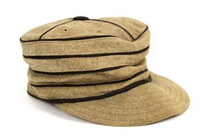
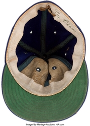
When New York Giants manager John McGraw mocked the fledgling team as a "white elephant," Connie Mack defiantly adopted the pachyderm as the team's mascot. The elephant appeared on caps, jerseys, and became the franchise's first iconic symbol.
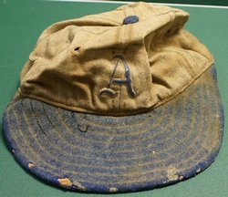
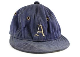
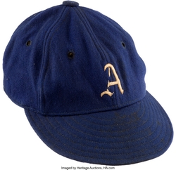
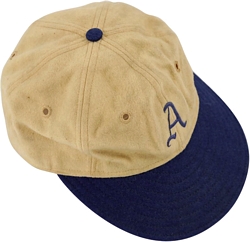
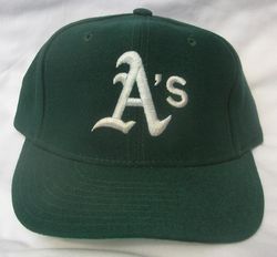
As the franchise matured, the cap simplified to a bold white "A" on navy wool — a design so timeless it would be echoed by every subsequent Athletics cap. This era saw five World Series titles and some of baseball's greatest players.
The move to Kansas City brought new energy and eventually the flamboyant Charles O. Finley, whose bold experiments with color and style would set the stage for the franchise's most iconic look.
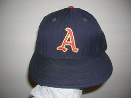
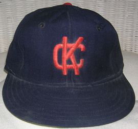
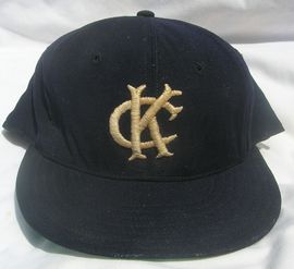
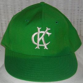
Kansas City kept the navy palette but introduced interlocking "KC" lettering. The elephant lingered briefly on sleeve patches before fading. Under Arnold Johnson's ownership, the team struggled but developed a loyal Midwest fan base.


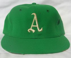
When insurance magnate Charles O. Finley bought the team in 1960, everything changed. He introduced "Kelly Green, Wedding Gown White, and Fort Knox Gold" — colors previously unseen in baseball — and transformed the club's visual identity forever.
The move across the Bay created baseball's most recognizable color scheme. From the Mustache Gang dynasty through Moneyball and beyond, the green and gold cap became a cultural icon far beyond the diamond.
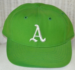
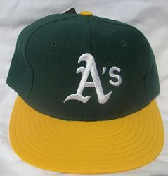
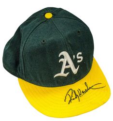
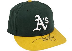
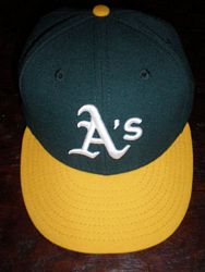
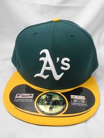
The Athletics arrived in Oakland with a deeper, richer green and a gold "A" that would become the franchise's most enduring symbol. Paired with white cleats — revolutionary at the time — these caps announced a franchise that refused to play by the rules.
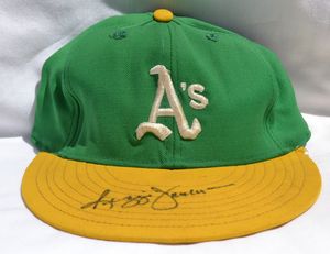
Three consecutive World Series titles (1972–74) were won wearing this cap. The ornate "wedding script" lettering gave the word "A's" an elegant flair that matched the team's swaggering personality — handlebar mustaches, white shoes, and all.


The elephant returned — this time swinging a bat. This playful logo update coincided with the franchise rebuilding into a powerhouse. By decade's end, the "Swingin' A" graced the caps of the Bash Brothers as they terrorized American League pitching.


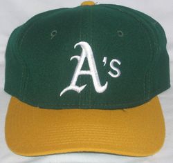
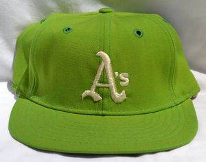
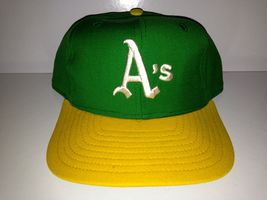
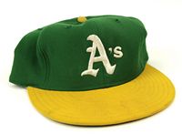
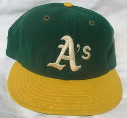
Green crown, gold bill — the definitive A's cap. Canseco and McGwire made this design famous with their forearm-bashing celebrations. This cap appeared in three consecutive World Series (1988–90) and became the best-selling cap in baseball.
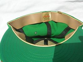
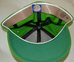
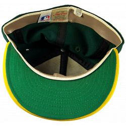
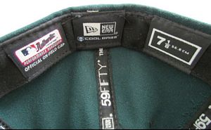
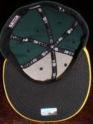
A subtle but important refresh: the green deepened, the "A's" script was updated with a slightly more modern italic feel, and the overall silhouette moved to the fully structured New Era 59FIFTY shape that would become standard across MLB.


Same classic design, new context. Billy Beane's revolutionary approach to roster construction made Oakland the smartest team in baseball. The green-and-gold cap became synonymous with doing more with less — and the New Era 59FIFTY fitted became the definitive version.

The inverted color scheme — gold crown with green bill — became a fan favorite for road games and Friday home games. Paired with gold jerseys for "Gold Friday" promotions, this alternate became a streetwear staple.


The elephant came stomping back as an alternate cap logo — in a more aggressive, modern pose. Worn for batting practice and spring training, it became one of the most beloved alternates in MLB and connected the modern franchise to its 1902 origins.
October baseball meant special patches on the side of the cap. Through the Moneyball dynasty's playoff runs — 2000, 2001, 2002, 2003, 2006, 2012, 2013, and 2014 — these patched caps became collectors' items and symbols of a small-market team punching above its weight.


The most emotionally charged cap in franchise history. Special "Oakland" farewell patches adorned the final season's caps. Fan protests, sellout crowds, and tears made these caps instant relics of a city's love affair with its team.


A temporary home in Sacramento's Sutter Health Park while the Las Vegas stadium is built. The cap retains the green and gold but features a Tower Bridge "Sacramento" patch replacing the elephant sleeve patch — a subtle shift as the franchise transitions between homes.
The next chapter. A new $1.5 billion stadium on the Las Vegas Strip will house the Athletics starting in 2028. While the final cap design hasn't been revealed, expect the green and gold to remain — possibly with new desert-inspired elements and a modernized logo.
How the Athletics' green has shifted across 125 years — from navy to kelly to forest
From elephants to script to block letters — the Athletics' cap logos at a glance
Based on estimated sales data, fan polls, and cultural impact
In thousands of units — the Bash Brothers era was peak cap culture
Estimates based on industry reports, New Era sales data, and MLB licensing figures
Deep dives into the stories behind the caps
In a sport dominated by red, white, blue, and black, the Oakland Athletics dared to be different — and in doing so, created the most recognizable color combination in professional baseball.
The story begins not in Oakland but in Kansas City, in 1963, when Charles Oscar Finley — a self-made insurance magnate with a showman's instinct — purchased the struggling Athletics franchise. Finley looked at baseball's visual landscape and saw an ocean of sameness. He wanted something nobody had ever tried.
Green and gold. Fort Hays State colors, his alma mater's scheme. It was audacious. In the conservative world of 1960s baseball, Finley was proposing something garish, loud, and utterly unprecedented. The baseball establishment thought he was a clown. They would not be laughing for long.
When the team moved to Oakland in 1968, the green and gold truly came alive. The combination of deep forest green (#003831) and warm athletic gold (#EFB21E) created a visual identity that was simultaneously bold and sophisticated. Unlike the bright primaries used by most teams, the A's palette had depth and richness.
The genius of the color scheme lies in its versatility. The green crown with gold bill became the standard, but the palette allowed for endless variations: all-green for batting practice, gold crown for alternates, white panels for the classic look. No other team in baseball has this range within a two-color system.
The cultural impact extended far beyond the diamond. By the late 1980s, the green and gold A's cap had become a streetwear icon, embraced by hip-hop culture and fashion-forward youth in the Bay Area and beyond. MC Hammer — an actual former A's batboy — wore the cap in music videos seen by millions.
Today, more than six decades after Finley's gamble, the green and gold remains one of the most beloved and instantly recognizable color schemes in all of professional sports. Some things are just too perfect to change.
The Athletics' logo history is a story of defiance, reinvention, and the rare ability to honor tradition while pushing forward. It starts with an insult.
In 1902, New York Giants manager John McGraw dismissed Connie Mack's new American League franchise as a "white elephant." Mack, a shrewd and quiet man who managed in a suit and tie for fifty years, did something brilliant: he adopted the elephant as the team's mascot. The insult became an identity.
The white elephant appeared on Philadelphia Athletics caps, jerseys, and promotional materials for decades. It was a middle finger wrapped in early-century politeness — every win was a reminder to McGraw that his "white elephant" was anything but.
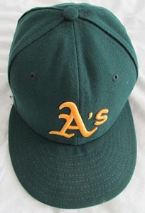
The move to Kansas City in 1955 began a simplification process. The elephant faded, replaced by interlocking "KC" letters and eventually a clean block "A." But when Charles O. Finley moved the team to Oakland, the logo entered its most dynamic period. The block gold "A" on a green cap was clean, modern, and powerful.
The 1970s brought the wedding script "A's" — ornate cursive lettering that matched the team's flamboyant personality. By the 1980s, the elephant returned as the "Swingin' A" — a pachyderm swinging a baseball bat, enclosed in a circle.
The most recent logo evolution has been the return of the stomping elephant in 2014. Worn on alternate caps, the stomping elephant connects the 21st-century Athletics directly back to Connie Mack's defiant response more than a century ago. The elephant endures because what it represents endures.
Green crown. Gold bill. Block "A's" with an apostrophe. It's the most perfect cap design in baseball history, and I will defend this position against all comers.
There are great caps in baseball. The Yankees' interlocking NY is timeless. The Dodgers' LA is clean. The Cardinals' StL has old-money elegance. But none of them achieve what the late-1980s Oakland A's cap achieves: the perfect marriage of color, typography, and cultural moment.
Start with the two-tone construction. The forest green crown sits atop a gold bill, creating a color break that gives the cap visual dynamism. Most baseball caps are monochromatic. The A's two-tone design creates depth and interest. Your eye moves from the green crown to the gold bill to the gold logo and back again.
Then there's the typography. The block "A's" lettering with its apostrophe is deceptively simple. The "A" is strong and geometric, the apostrophe adds a casual, almost conversational quality — like the team is saying "we're the A's" with a shrug and a grin.
But what elevates this cap from great design to iconic design is context. The late-1980s A's were the last great team to have genuine personality. Jose Canseco and Mark McGwire bashing forearms. Rickey Henderson stealing bases with theatrical flair. Dennis Eckersley pointing at batters after punchouts. This cap sat atop all of it.
The cap crossed over. MC Hammer wore it. Ice Cube wore it. It showed up in music videos, on street corners, in skate parks. The A's cap became a Bay Area identity marker that transcended sports allegiance.
Walk into any cap store today, more than thirty-five years later, and the green-crown-gold-bill A's fitted is still on the wall. It still sells. It still turns heads. No cap in baseball is as perfectly designed, as culturally significant, and as enduringly cool as the 1980s Oakland Athletics cap. It's not close.